So much of the software out there is amazingly powerful. People work on it for years and years, adding feature after feature, to the point you can use it for anything from sending emails to visualising your dental fillings. The problem with software that can do anything is that it effectively does nothing. Sit down in front of an app made entirely of buttons and toolbars, or sit down in front of a blank piece of paper – the problem of where to begin is the same for both. A powerful app needs a powerful interface.
 vs.
vs. The problem with software that can do anything is that it effectively does nothing
Look at Microsoft Word. Positively ancient by software standards, and every release adds more on top of the one before. Eventually, the usability started to fall apart under its own weight. Huge menus and toolbar after toolbar, putting at the forefront just about every function it had. The introduction of the ribbon tried to isolate things so that common tasks were at the fore, less common tasks essentially hidden, and tasks related to your current context pop in and out.
User centred design is all about bringing the user's needs to the front. In terms of a UI, the things a user is most likely to do have to be up front and obvious. So instead of a hundred buttons all equally emphasised, put the most likely in the foreground and hide (or even remove) the unlikely ones. It's all about designing the screens and flows for the app based on what the user needs. Best practices for this can be found in nearly every OS style guide and the most usable applications all do this. They hand-hold you through a journey of screens of data and features.
This works really well for the case when you're at your desk or sitting down with your phone to use the app.
Every moment spent in the app is a moment of your life you're not getting back
However, when you're using an app to help with some real world task, your goal is not to use the app. The point is to get in, get the info, get out and get on with the stuff that matters. Every moment spent in the app is a moment of your life you're not getting back. So, in this case, the best app is not just the most usable one, but the most non-existent. A few big, easy to hit buttons, and maybe a text field if really truly necessary. That's it. Anything else and you're being forced to use the app, and not to do your task. User centred design is not enough. You need task centred design.
Classically, this is a hard problem to solve. The designer knows what the user can do, and the computer can determine the most popular things to do, but that's where things usually end.
Enter mobile computing...
Once you get away from your desk, the problem actually becomes easier. When the computer knows where you are and what your job is, it can reduce the number of options to present you drastically.
This is why FixMarQ uses QR codes and gives people roles. Scanning a QR code gives the app your precise location. Your role (user, fixer, manager, etc) tells it what you can do and what you're likely to want to do. And the app's knowledge of the space tells it what's around you and how it all relates to you.
Consider...
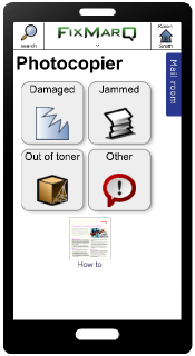 You're in the mailroom next to the photocopier. If you're using the app, it's either because the photocopier has a problem, or you don't know how get it to do something. So, the app should show a list of a few common problems and an online how-to guide.
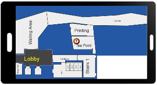
You're a plumber assigned to fix a clogged sink. You're in the building, but not in the room with the sink. You most likely need to see a map showing you where to find the sink.
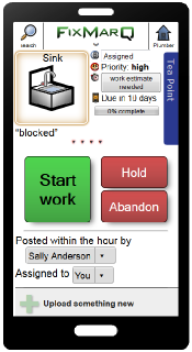
 You then make your way to the room. You probably want to see the details of the job, or just start a timer to say
 I'm working on this now
so you can track your hours.
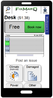 You're in a coworking space and at a desk you can reserve. You probably want to book it now, though you might want to make a reservation for later or maybe tell the staff about a problem with it. That's 3 options, in order of importance, all reflected in 3 UI elements.
Sure, there are other things you could want to do – find where your coworkers are sitting, or make a note for others about the great view from there, or find out what's for lunch in the canteen tomorrow. But those are more involved tasks, and can be put in secondary, but findable places in the UI.
FixMarQ is organised on these lines. There are the parts which support the user in the real world to do a few quick things. Those are task-centric, and appear front and centre, with big buttons that can be hit by wiggly fingers by just glancing at the screen.
There are the deeper interactions where the user journeys though the app – browsing, investigating, managing. They take longer to do, but are optimised on user-centric principles.
Then there's the boundary between them. Menus, gestures and buttons on the periphery of the screen, and in consistent places and colours so you can dive in at a glance. You shouldn't really need to engage with the app until you're at the right screen to do your work.
A good app is easy to use. A great app is easy to not use.